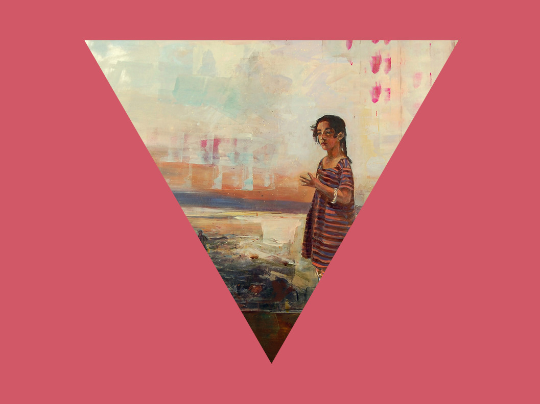
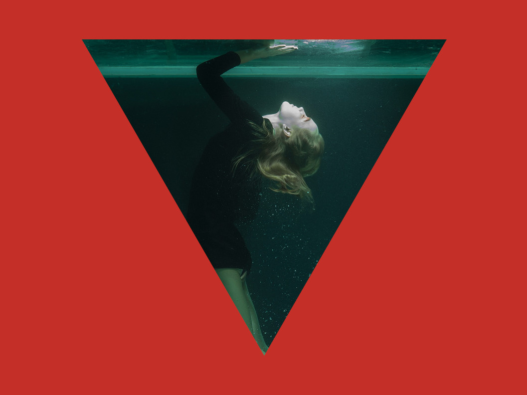
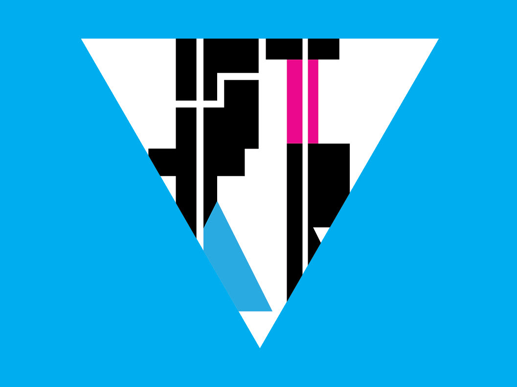
Covers. Image; Jarid Scott's <y83rpx_27
This is a magazine.
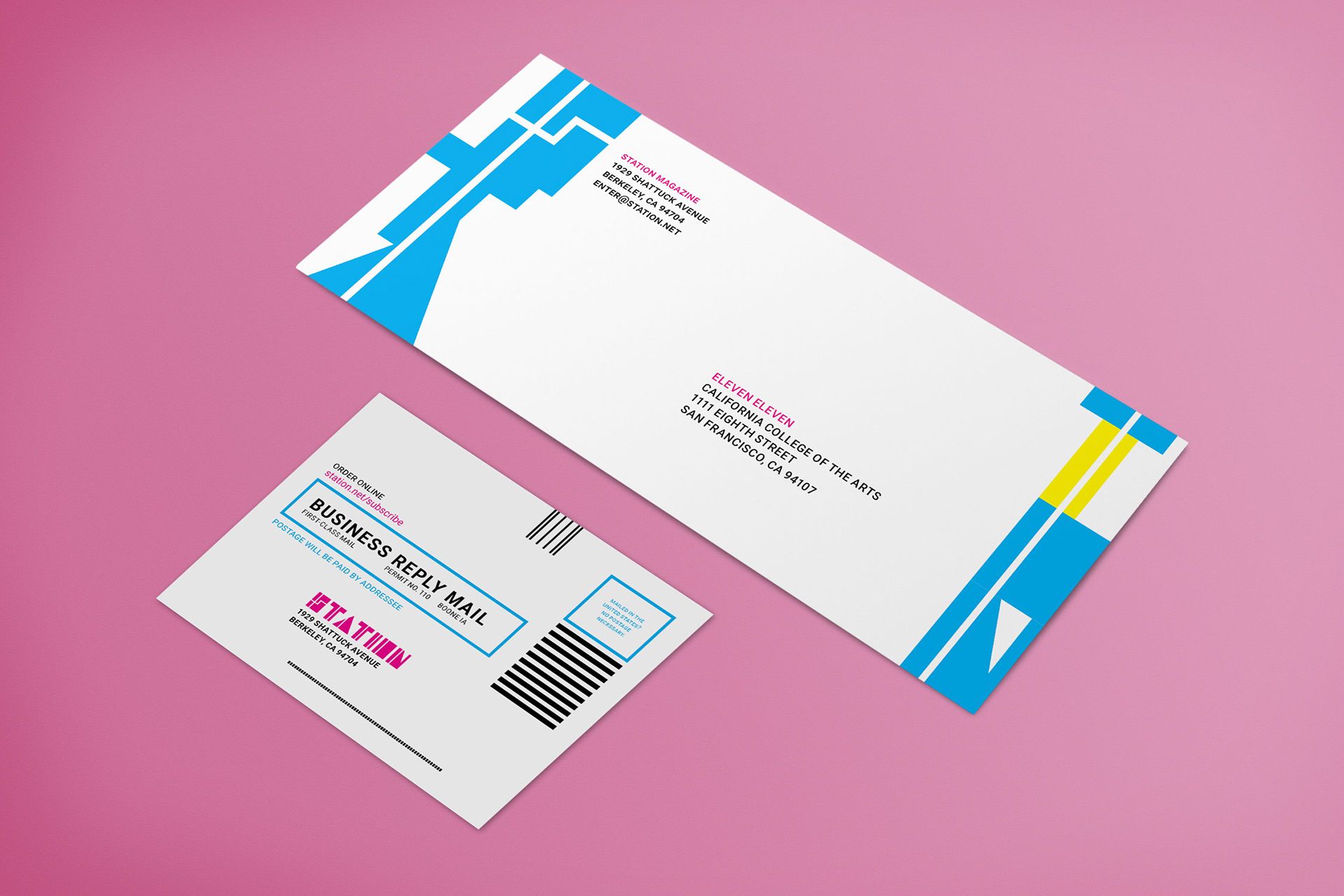
If art should mirror reality, STATION welcomes those readers who view the world—its present and especially future—through a digitized lens. STATION is a print magazine that showcases the finest visual, musical, and writerly talent in science fiction, shifting the paradigm of fine art toward this “genre of ideas”. Drawing from the aesthetics of cyberpunk and retrofuturism, STATION provides a stylish platform for the exchange of artistic concepts within the sci-fi realm, filling a niche that was hollowed out—though never quite occupied—by more traditional publications like Clarkesworld and BLUECANVAS.

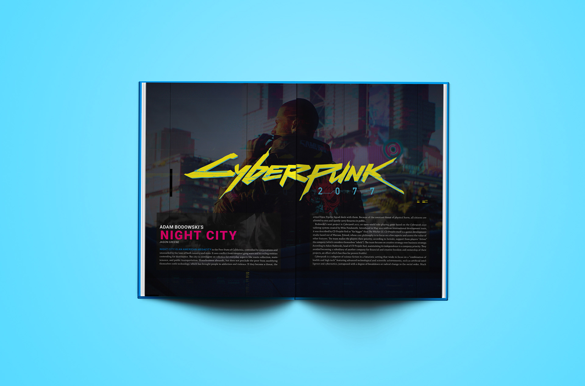
Where did it begin?
STATION began as an experimental typeface, a collection of glyphs that conveyed a sense of mass and verticality—such qualities that brought to mind the glowing neon banners of Tokyo, and resulted in the creation of this magazine. Thusly, STATION had to utilize this typeface, and demanded an equally striking color palette. While the magazine’s cover would remain typographically light, these objectives would lay the aesthetic groundwork for a publication that “feels” science fiction, at home in the digital newsstands of the near future.


How was it designed?
Science fiction has a (sometimes deserved) reputation as a “pulpy” genre, and many such designs are overladen with visual clutter—heavy sans serif print, intricate illustrations, and claustrophobic kerning abound. STATION is assembled differently: it reasserts negative space through more refined typography and a grid system that provides ample room for media content. Headlines are set in Roboto, while body text (including the masthead) is set in Chaparral Pro, always with 4 points of leading. These typefaces synergize well, as Roboto’s geometric proportions are complemented by Chaparral’s rigid slab serifs. Geometry is further expressed in each page’s layout, which emphasizes sharp angles that bleed off the page; when circles are present, they are a part of a visual system that is stylized after computer circuitry. Meanwhile, STATION has a true CMYK palette: these garish colors are evocative of the neon lights in science fiction and cyberpunk, but are used sparingly within the magazine itself to avoid stressing the reader’s eyes.
