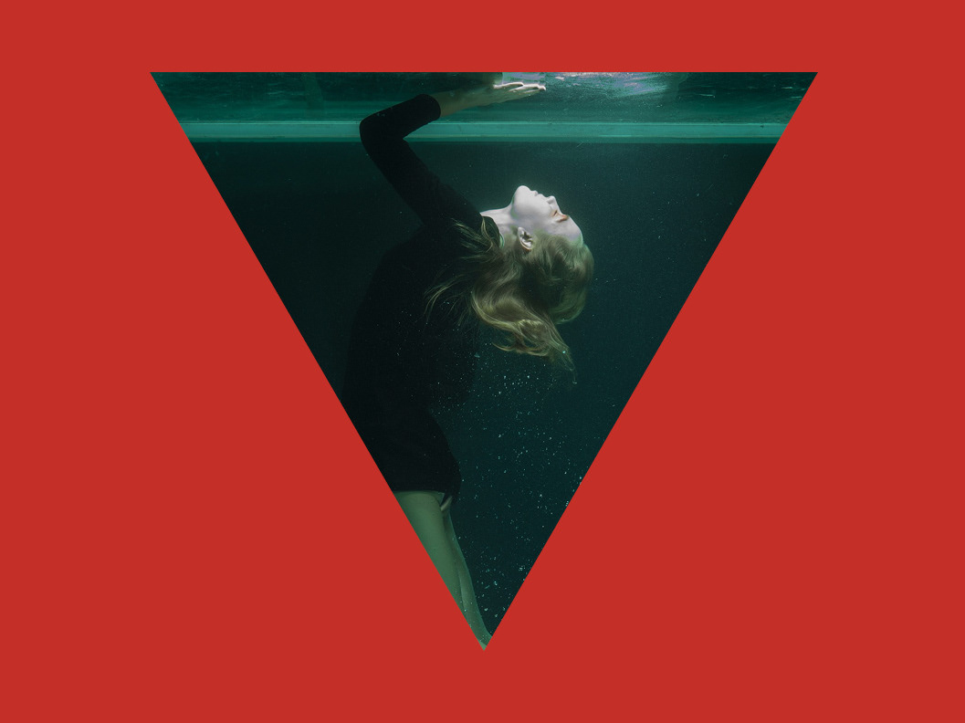
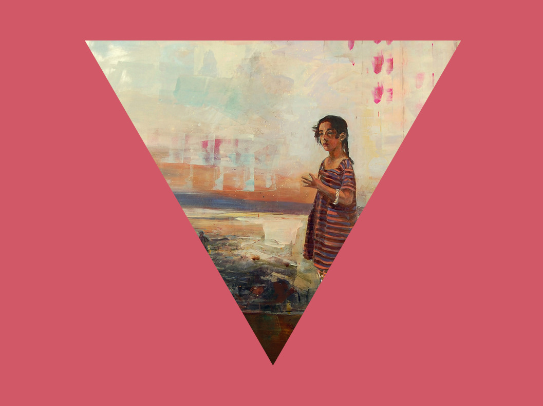
Covers. Images; ALE + ALE's Fiori Bacio, Brad Kunkle's The History of Nature, Paco Pomet's The Visitor
This is a magazine.
Arroyo Literary Review is a print-based publication produced annually by students and alumni of California State University, East Bay. Each issue reflects the creative diversity found in the San Francisco Bay Area literary scene, while bringing together material from an international array of poets, writers, and artists.
Arroyo began with an investigation: faculty and students sought to establish a magazine capturing the spirit and diverse voices of the Bay Area while attracting writers from across the country and a national readership. What they discovered, however, was a void. Bigger presses seemed to ignore the dynamics of California culture, while smaller presses had predicated themselves on niches. With the opportunity presenting itself, those same students built the school’s first literary magazine from the ground up, eventually releasing the premiere issue in the spring of 2009.
Since then, that tradition of motivation and commitment has been passed on to each proceeding incarnation of the review. The editorial staff remains dedicated to showcasing both new and established writers from the West Coast and beyond, hoping to connect the magazine’s audience with the unique qualities that make the Bay Area literary and art scene so special.
How was it designed?
Arroyo Literary Review was my first foray into print design. A small but lauded publication within literary circles, Arroyo—then celebrating the release of its eighth annual issue—had a strong visual identity when I began in my role as Design Editor. The aspects of this system are evident throughout my work on the stationery set: the logo, set in Modern No. 20; its alignment toward the top of the page; an austere, classical minimalism with plenty of negative space for text; and a greater emphasis on content over illustrative design elements. Always, however, there is room for iteration—and nowhere is this most evident than on Arroyo’s front covers. Previously, the logo would be placed on top of the cover image, obscuring visual elements or forming unusual shapes that might distract the viewer. Layer masks provide a solution to these problems: when carefully applied, portions of the image are superimposed over Arroyo’s logo, allowing it to blend seamlessly as a feature of the painting without sacrificing readability. This small yet substantive addition serves to augment Arroyo’s focus on the fine arts.
