This is a music festival.
Once a premier jazz event in the Bay Area, the Berkeley Jazz Festival had opened annually at Berkeley’s Greek Theatre (originally known as the Hearst Greek Theatre). Featuring such legendary performers as Miles Davis, Ella Fitzgerald, and Dexter Gordon, this multi-day event was a celebration of jazz and introduced new generations of listeners to the genre during its heyday. This reimagining of the Berkeley Jazz Festival sees a return of its multi-day format, where regional and international artists would headline the event to showcase the thrilling new dimensions jazz has entered since the festival’s closure in 2008.
Where did it begin?
Designing for the Berkeley Jazz Festival poses an interesting challenge: as a cultural hub, Berkeley’s light poles and bus stops are swarmed with layers of concert fliers, making it difficult for any one advertisement to stand out. Coupled with the niche appeal of jazz music, such an advertisement demands a visually striking design in order to attract attention from dedicated listeners as well as curious passersby. It is also necessary for this design to feel at home within more formal establishments—and, of course, it must still communicate details about the event in a concise manner. Furthermore, existing advertisements of the Berkeley Jazz Festival have no clear visual identity; while they are all evocative of jazz, they do not always evoke Berkeley.

How was it designed?
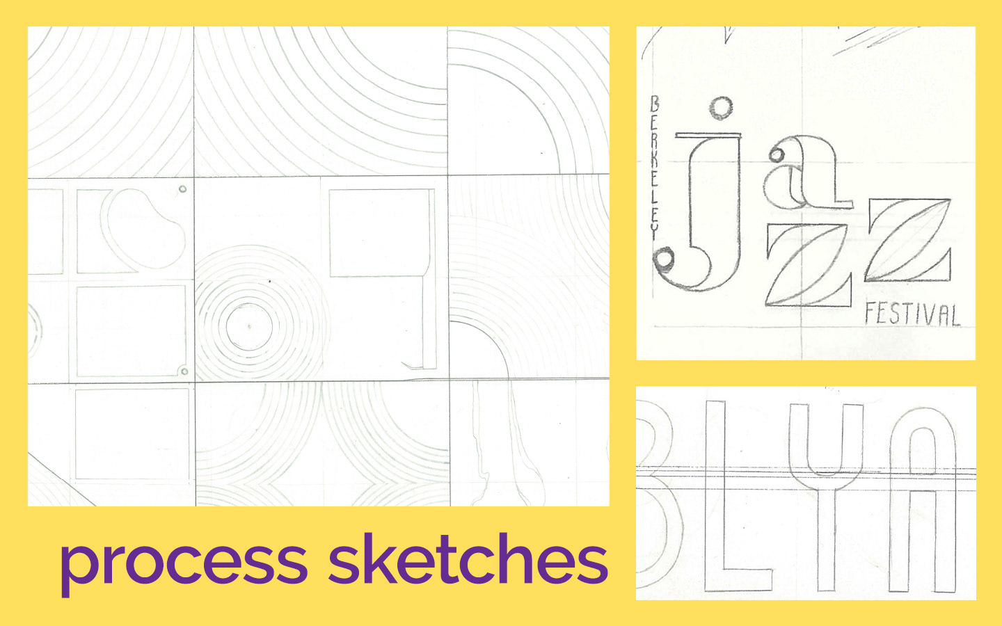
In response, this project endeavors to resurrect the Berkeley Jazz Festival with stylish flair while adhering to a clearer visual identity. Drawing inspiration from UC Berkeley’s jazz studies program, a custom logotype was crafted to represent the event. “Jazz” is drawn as a striking, Bodoni-esque Didone, and jauntily staggered to the rhythm of a free-flowing tune. Meanwhile, “Berkeley” and “Festival” bring to mind the city’s official logotype: a slender, vertically-stressed sans serif with a tall x-height. Beyond the logotype, two typefaces were selected to convey the bulk of the festival’s technical information: Renner* (now named Jost*), a modern reinterpretation of Paul Renner’s Futura; and Adobe Caslon Pro (commonly set in 8/11). Each typeface follows in the spirit of the festival’s logotype, while providing much improved readability.

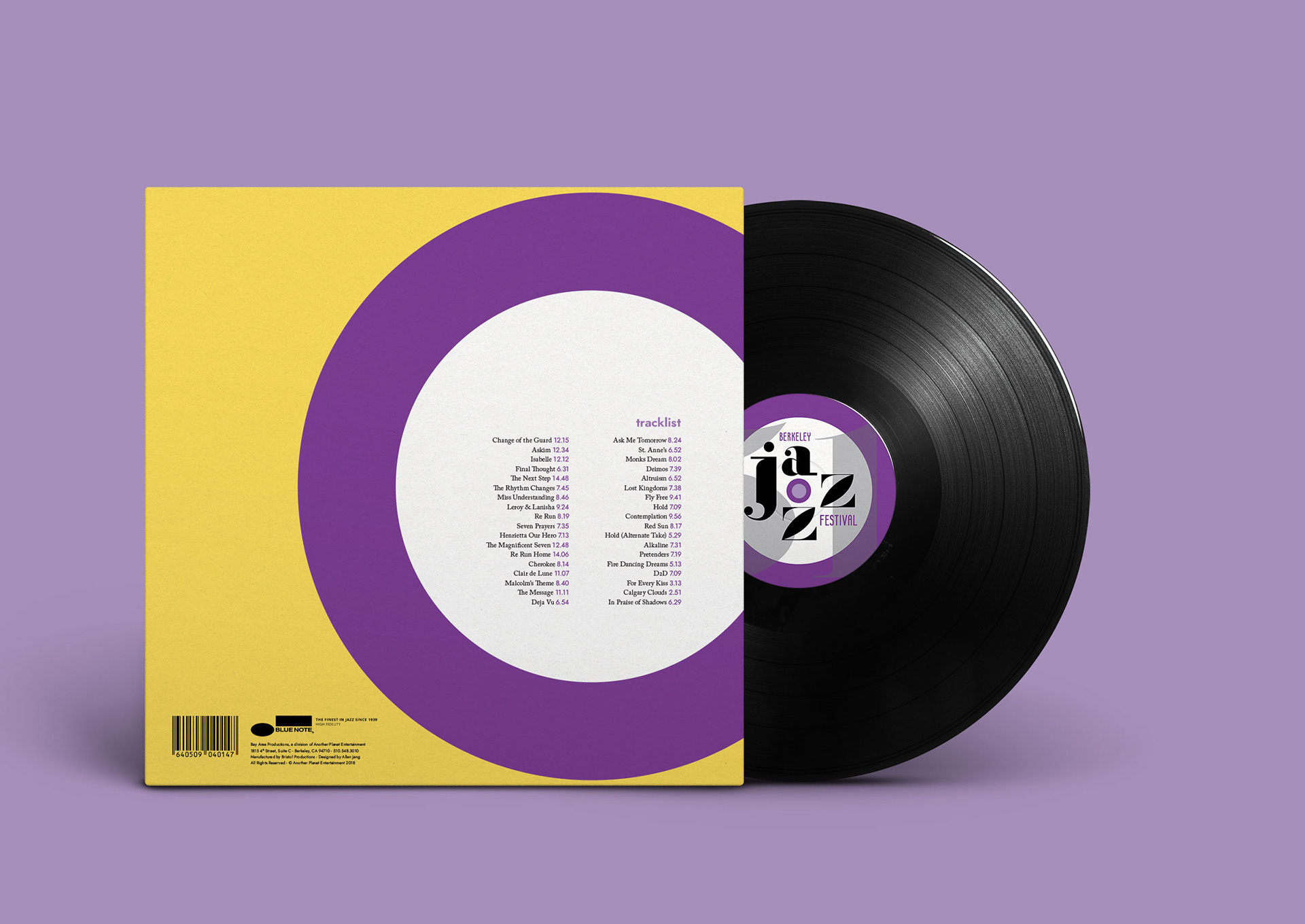
The design process, continued.
The illustration’s design takes after a vinyl record and player needle, yet is vectorized to impart a clean, modern appearance—a far cry from the “vintage” textures that the genre often evokes. Each illustrative element strives toward a purpose: artist names are caught within the grooves of the vinyl, while the needle points the viewer to information even as it decorates the page. Asymmetry is evident throughout the design, translating the eccentric and electrifying rhythms of jazz into an aesthetic which draws the viewer’s eye, whether along the street or within a concert hall. Furthermore, the color palette has been deliberately restrained: one primary warm color (yellow), one cool color (purple), black, and white. Hints of purple—always associated with typography—lend a stateliness to the festival’s aesthetic that is contrasted sharply by the energy of the yellow, a motif similarly echoed through the application of black and white.
