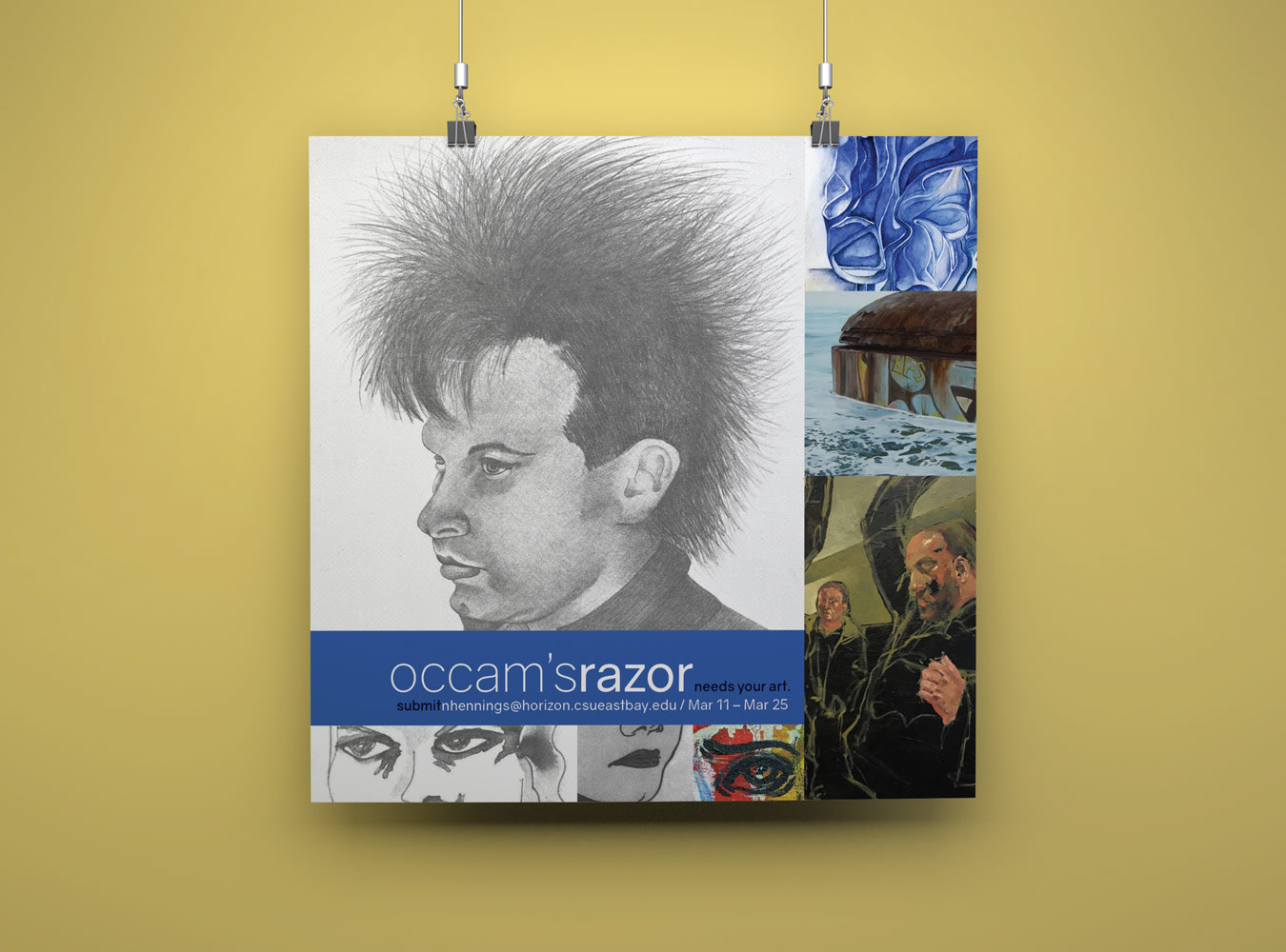
Covers. Images; Meghan Hart's Underwater, Grace Munakata's Vishnu Padi, Edrielle Belisario's Untitled
This is a magazine.
Occam’s Razor has a storied history: as the first student-directed literary magazine of California State University, East Bay, Occam’s Razor has seen the debut of such literary talents as Eric Neuenfeldt and Daniel Riddle Rodriguez. Presently on its thirty-fourth issue, the magazine is celebrated by CSU East Bay’s English department and widely read by its students, as well as undergraduates of the Art department.

Where did it begin?
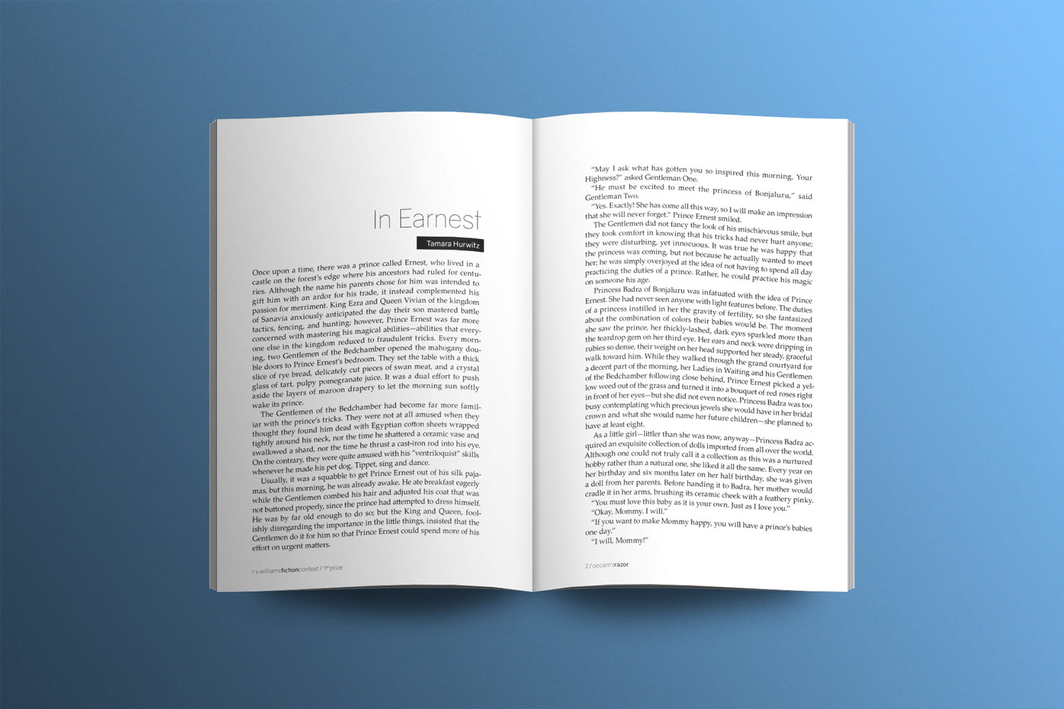
Occam’s Razor has passed through many editors’ hands, and each student team has dramatically overhauled the design of the magazine—such that it no longer has a stable visual identity. The most recent issues of Occam’s Razor have also drawn criticism for too closely resembling Arroyo Literary Review, CSU East Bay’s graduate-level magazine. My work seeks to address these matters by establishing a minimalist design—striking typographic contrast with the usage of a sans serif display face, intelligent usage of negative space, and large differences in size and weight.
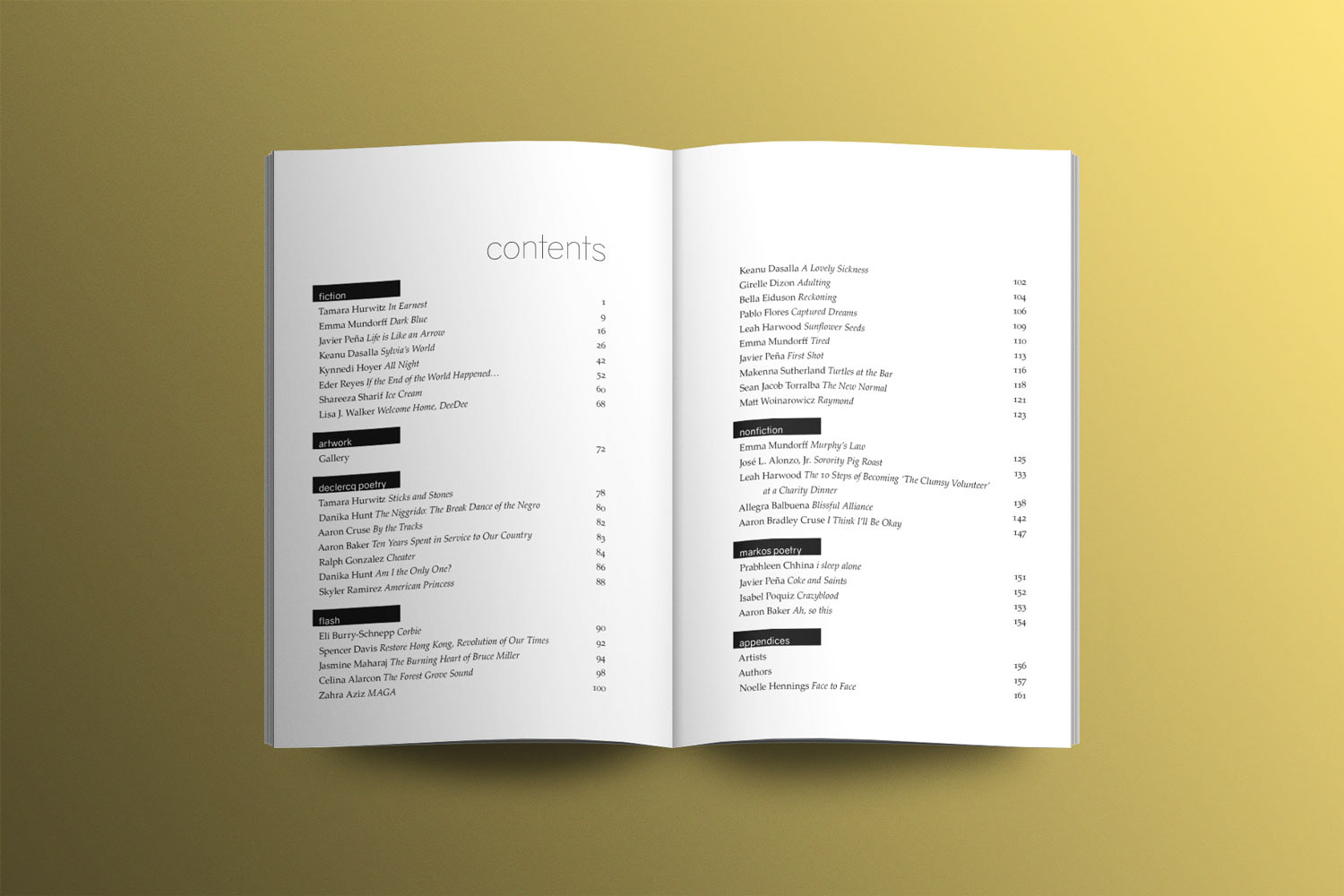
How was it designed?
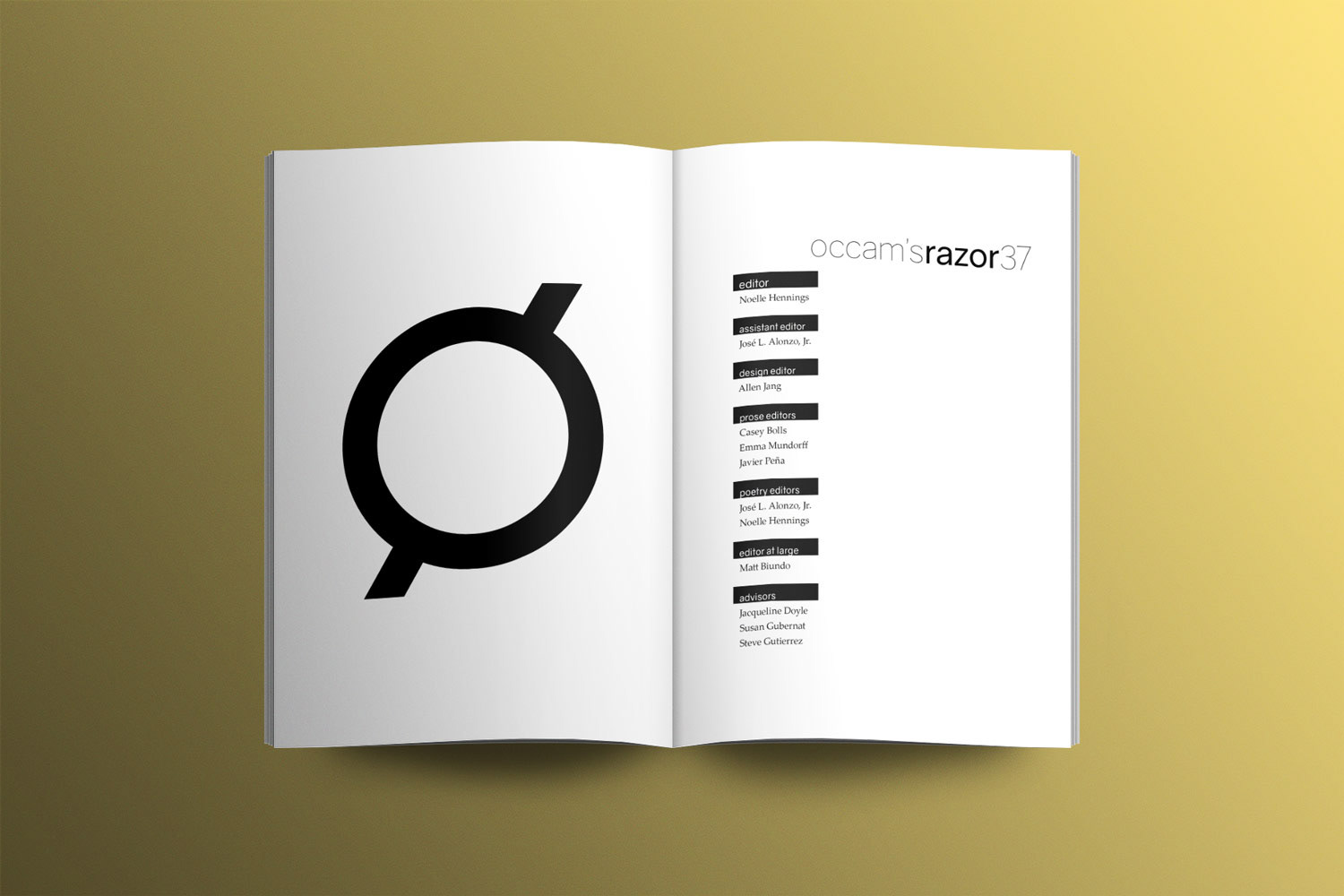
This redesign of the magazine adheres to the popular definition of “Occam’s razor”: the simplest solution tends to be the correct one. Two typefaces were selected to establish the new visual identity of Occam’s Razor: Gravity, a neo-grotesque, sans serif typeface (36 for titles); and Palatino Linotype, an extended version of Hermann Zapf’s Palatino typeface (10/14 for body text). These typefaces contrast each other excellently, distinguishing between displays and content without the need for labels. A recurring idea throughout Issue 34 is the solidus, which is the “razor” made typographic—a swift slash that bisects the logo, each category in the table of contents, and finally the magazine’s folios. Furthermore, this issue establishes a highly asymmetrical layout, which maintains visual interest even while it facilitates the reading process.

