Staircase. Image; Stock Photography
This is environmental design.
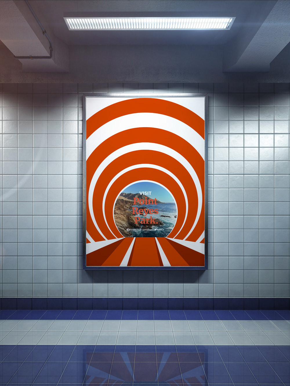
This project approaches environmental signage from a place of pragmatism: the urban cityscape. The work presented here imagines a “return to nature,” igniting awareness and support for Bay Area's wilderness—beginning inside one's local Bay Area Rapid Transit (BART) station. Ultimately, this campaign aims to encourage tourism to local and regional parks that are accessible via BART, particularly in an era where the natural world is increasingly under threat from political and corporate interests. Marketing would be directed by the Sierra Club’s San Francisco Bay Chapter, as well as the BARTable program; accordingly, specific assets are designed, including a staircase wrap and large print posters.
BART Signage. Image; Stock Photography
How was it designed?
Here, space dictates the design. Drawing from the architectural language of the Transbay Tube, wall-mounted banners pull the viewer's gaze away from the claustrophobic platforms of the BART station and toward a Californian landscape. As each tunnel exits into a local or regional park, commuters are transported into these environments as places of discovery and recreation. Staircase wraps eschew large landscapes entirely for images that feature natural verticality—in this particular context, waterfalls. Finally, signage is rendered in the brand colors of the Sierra Club, and, alongside white, are assigned in analogous pairs. These hues also draw the viewer’s eye toward the text within, which alternates between Merriweather and Lato Black.
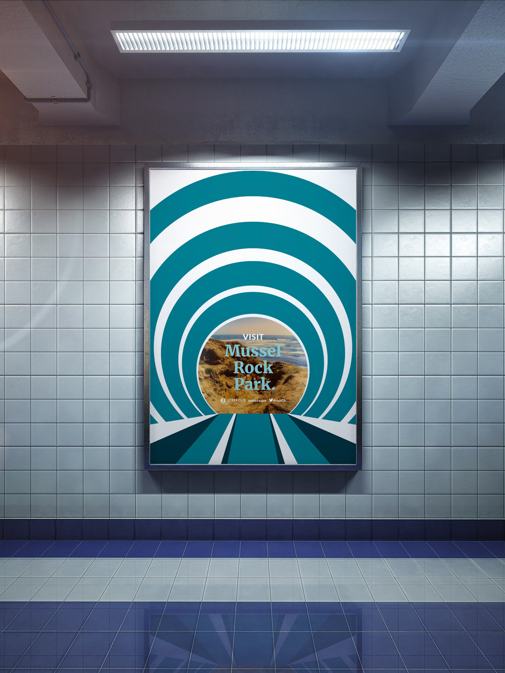
A modular template.
The layout of this design is readily adaptable to other media, from digital banners to print publications. Below, one such poster has been prototyped within the Spring 2020 issue of "The Yodeler," the Sierra Club's quarterly print newsletter. I had the pleasure of working on "The Yodeler" alongside Minda Berbeco, then Director of the San Francisco Bay Chapter, in late 2019.
